What is User Experience Design, Anyway?

“I am not that tech savvy!!”
“Computers hate me!”
“I can’t figure out this website!”
We’ve all heard it… or even said it ourselves. In this tech saturated world, we are constantly learning how to use new devices and websites. It’s a love-hate relationship, really. When you come to a new app or website, you have one of two reactions; “Well, that was easy” or “where is it!? How do I use this!?” It’s after the second reaction that you want to throw your computer out the window. The user experience is what is going to make you love a website, or absolutely hate it. Bad user experience (UX) design will make you wish you could go back to a time where flip phones ruled the earth.
What is UX design?
The internet has been around for only 25 years. UX design has been around for an even shorter time, and the extent of UX design is still evolving. UX design is defined by as many people who are trying to define it. The best way that we can explain it is that it’s a concept of many dimensions and it includes a variety of disciplines such as information architecture, visual design, and interaction design. For many people, the word “design” is associated with creativity, colors, and graphics, when really its true definition lies in functionality, as well as the process behind making products that work well for the people who use them. UX design is the process of designing digital or physical products that are useful, easy to use, and delightful to interact with. The sole objective is to design a system that offers a great experience to its users.
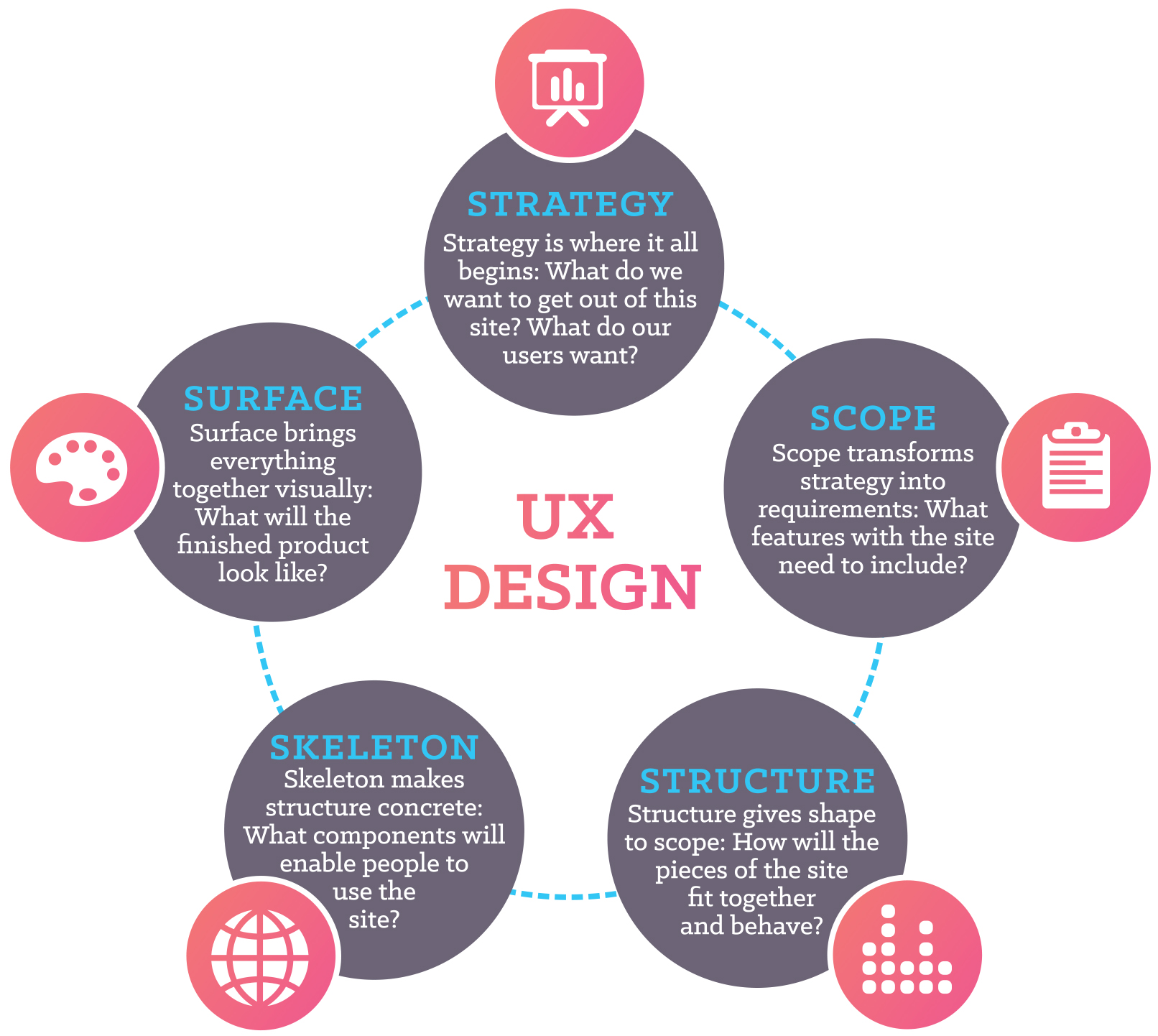
To better understand how UX design is executed and what the process is, let’s look at the elements of UX design by Jesse James Garrett.

The Elements of UX design
1. Strategy
The goal of UX design is to allow users to to reach their goals, or allow users to get what they came for in the easiest and most pleasurable way possible. Strategy is where it all begins: What do we want to get out of this site? What do our users want? The strategy phase of the UX design process determines not only what the owners of the website want to get out of it, but what the users want to get out of the website as well. Creating a strategy includes narrowing down the key objectives of the website. After much research and analysis, these strategic objectives are then configured and applied to the target audience of the website.
2. Scope
Scope transforms strategy into requirements: What features will the site need to include? Scope includes the creation of functional specifications: a detailed description of the “feature set” of the product. The scope also determines the content requirements: a description of the various content elements that will be required.
3. Structure
Structure gives shape to scope: How will the pieces of the site fit together and behave? The scope is given structure through interaction design: how the system behaves in response to the user. The content on the website is also given structure through information architecture: the arrangement of content elements within the information space. Interaction design and information architecture are both very dense disciplines, so much so that larger websites have people who hold job positions doing only one or both of these disciplines. Amazon.com has a team of information architects whose sole purpose is to structure content to be as relevant to users as possible.
4. Skeleton
The skeleton makes the structure concrete: What components will enable people to use the site? The skeleton phase breaks down into three components: information design: the presentation of information in a way that facilitates understanding, interface design: or arranging interface elements to enable users to interact with the functionality of the system, and navigation design: the set of screen elements that allow the user to move through the information architecture. The skeleton of a website is laid out in website wireframes, also known as a page schematics or screen blueprints. A wireframe is a visual guide that represents the skeletal framework of a website and determines the placement of buttons, tabs, photos, and blocks of text. The skeleton is designed to optimize the arrangement of these elements for maximum effect and efficiency.
5. Surface
Surface brings everything together visually: What will the finished product look like? The surface is the visual aesthetics of a website. The surface design is built on top of the structure, making the elements of a wireframe aesthetically pleasing. This is where the colors and graphics come in. A poorly-designed website will damage the desirability and the value of the website. So, when approaching the surface design, it is very important to keep the target audience and current trends in mind.
User experience functionality is every bit as essential as the aesthetic components of a website. You could have the best looking online platform or app on the market, but if your customers cannot quickly learn how to utilize it, they will leave it behind. If you want to guarantee a superb UX, you need to learn how to fulfill the precise desires of your users, with the minimum of effort. Website design and user experience design is ever evolving as technology progresses, it’s exciting to see what new disciplines UX design will entail in the future!
Sources:
- Garrett, Jesse J. The Elements of User Experience: User-Centered Design for the Web. United States: AIGA, 2003. http://www.jjg.net/. Web. 04 October 2016.