The Season of (Brand) Admiration
With the annual arrival of heart-shaped chocolate and glitter-covered greeting cards, the season of love has returned once again. So this month, we’re showing our admiration for the brands that have lured us in with witty one-liners, attractive packaging and well-curated feeds.
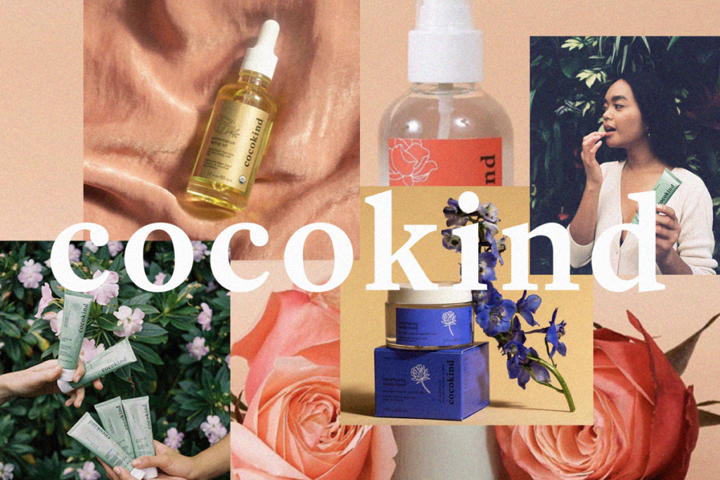
The contemporary branding behind cocokind mirrors their mission of clean and conscious beauty, with a natural aesthetic devoted to the colors and properties found in their skincare ingredients.

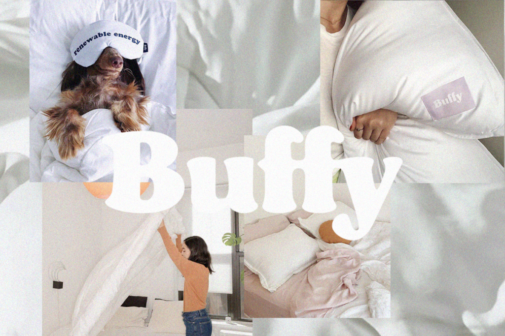
Presenting a marshmallow-soft message of comfort, Buffy’s breezy frame of mind is presented through a digital pillow fort of fluff highlighted by an aesthetic of clouds and snoozing pups.

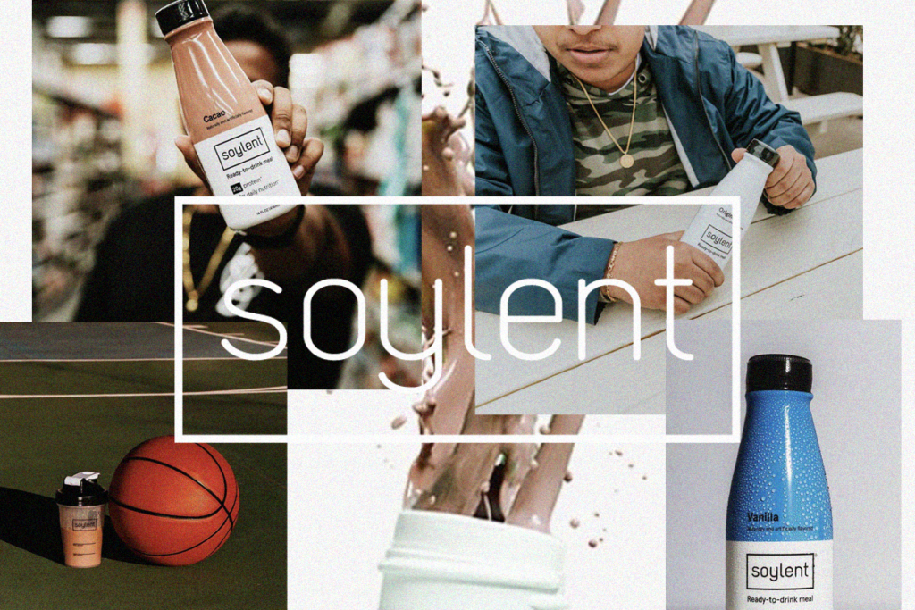
Minimalistic branding with only a sans serif font and blocks of color to distinguish each beverage flavor from one another encompasses the mission behind Soylent to keep nutrition simple.

Retro visuals are weaved together with the modern mission behind Kin Euphorics to provide contemporary nightlife alternatives through a mixture of elegant branding and design.

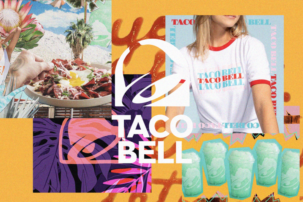
Balancing the bold with the basic, Taco Bell chose to simplify their mark to function as a solid platform for the vivid and youthful imagery used throughout social and brand marketing.

Taking an untraditional approach to an everyday product, Ritual brings a literal sense of transparency to their brand with a no-nonsense product design coupled with simplified branding.

We can’t help but feel giddy when a packaging design or well-curated feed immediately boosts our mood. While our hearts may be preoccupied, as connoisseurs of design, we know it won’t be long until a new brand comes around to sweep us off our feet.
Categories Design